Room Decode may earn a commission when you buy through links on this page. Product links are placeholders for now and will be updated with live affiliate links. As an Amazon Associate I earn from qualifying purchases.
A nursery can be calm without feeling blank.
This guide decodes the look through the choices that matter most: furniture scale, color, texture, lighting, storage, and the small details that make a room feel intentional. The goal is not to copy a photo exactly. The goal is to understand why the room works so you can recreate the feeling in your own home.
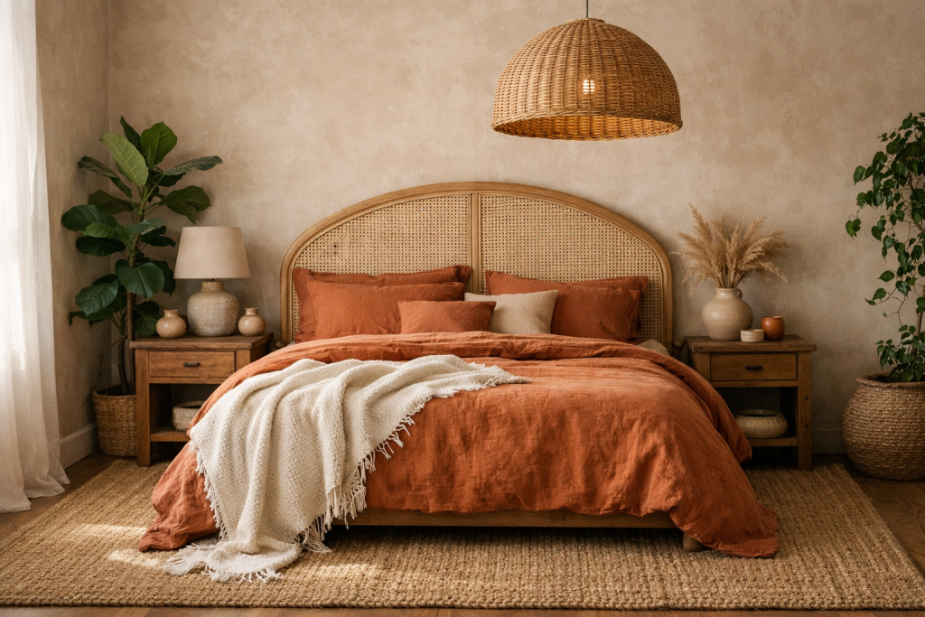
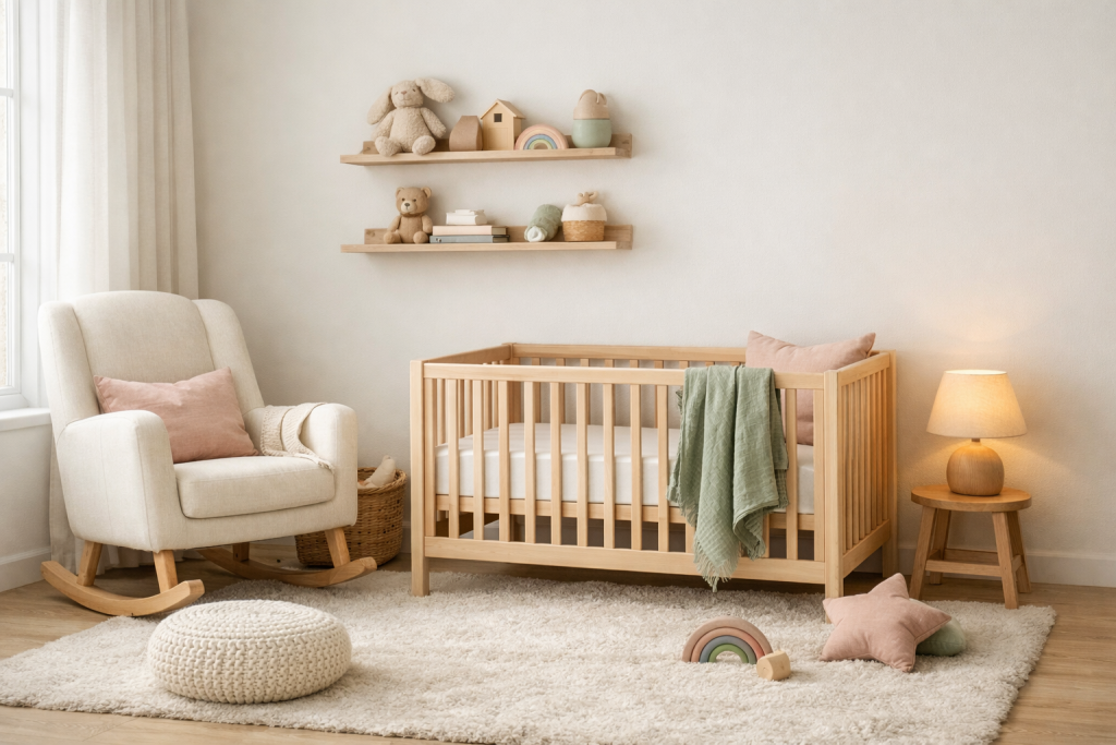
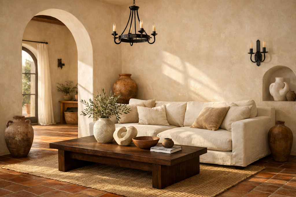
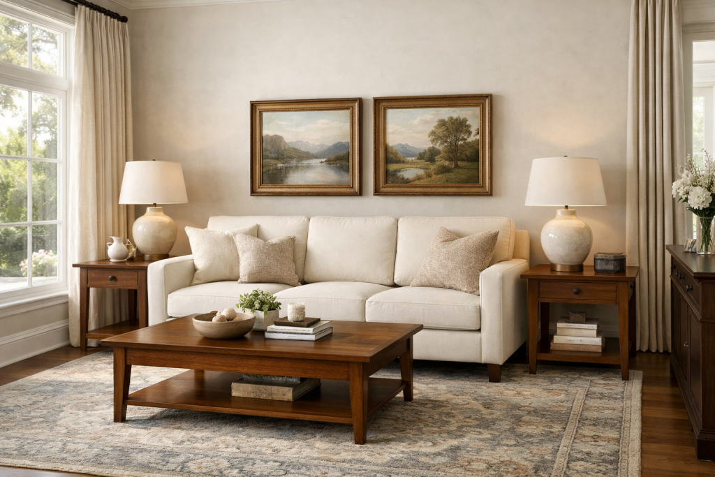
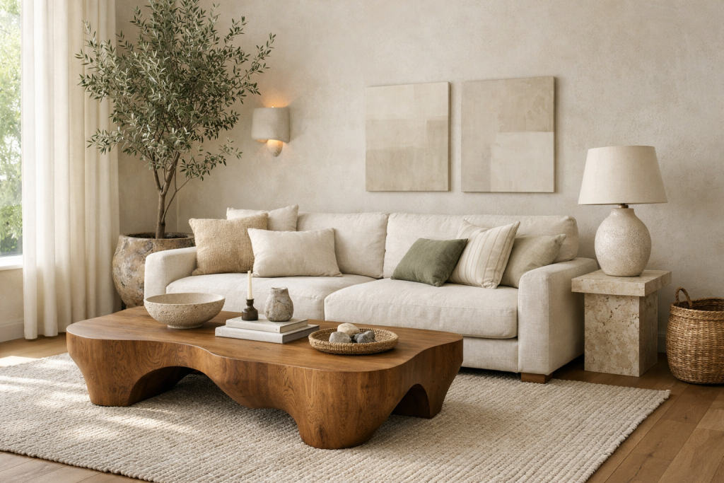
The palette here is built around pale wood, cream, sage, blush, oatmeal, and soft gray. That gives the design enough structure to feel cohesive, while still leaving room for personality, vintage pieces, and affordable finds.
The Room Decode
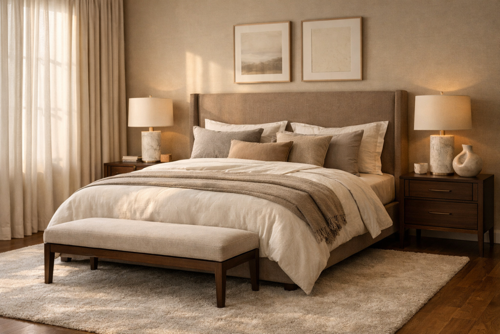
The key move is simple pale wood furniture and washable textiles. Once that is in place, the rest of the room can layer in texture, lighting, and useful decor without drifting away from the main idea.
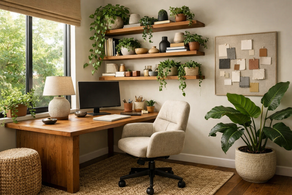
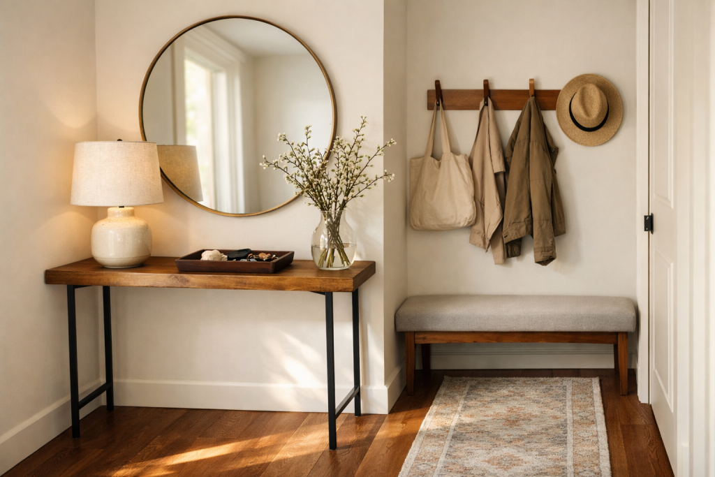
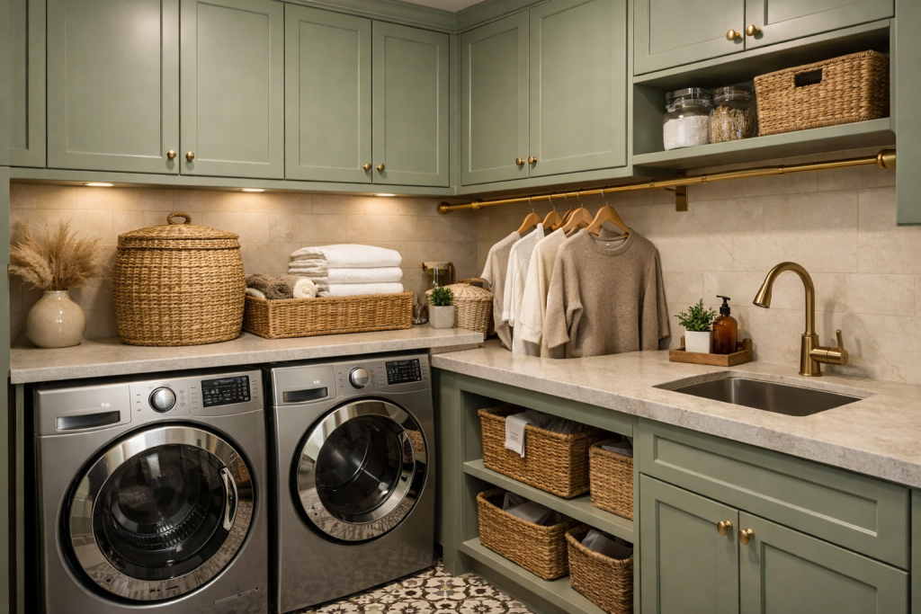
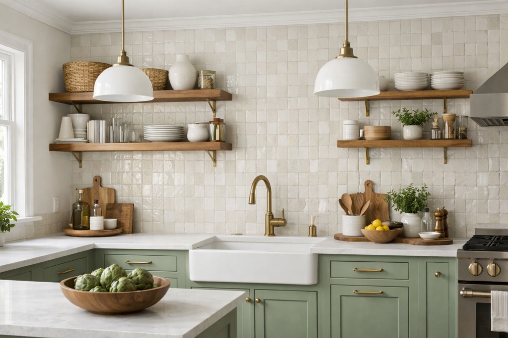
Start With Simple Pale Wood Furniture And Washable Textiles
The fastest way into this look is to choose simple pale wood furniture and washable textiles before you start filling the room with smaller decor. That anchor gives the space a clear point of view and makes every later decision easier.
For this style, the anchor should feel useful as well as beautiful. A room becomes more convincing when the biggest piece is doing real work: holding the seating area together, setting the palette, creating storage, or giving the eye a strong place to land.
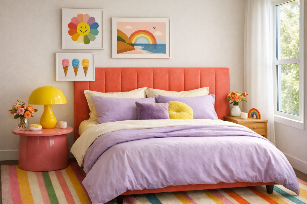
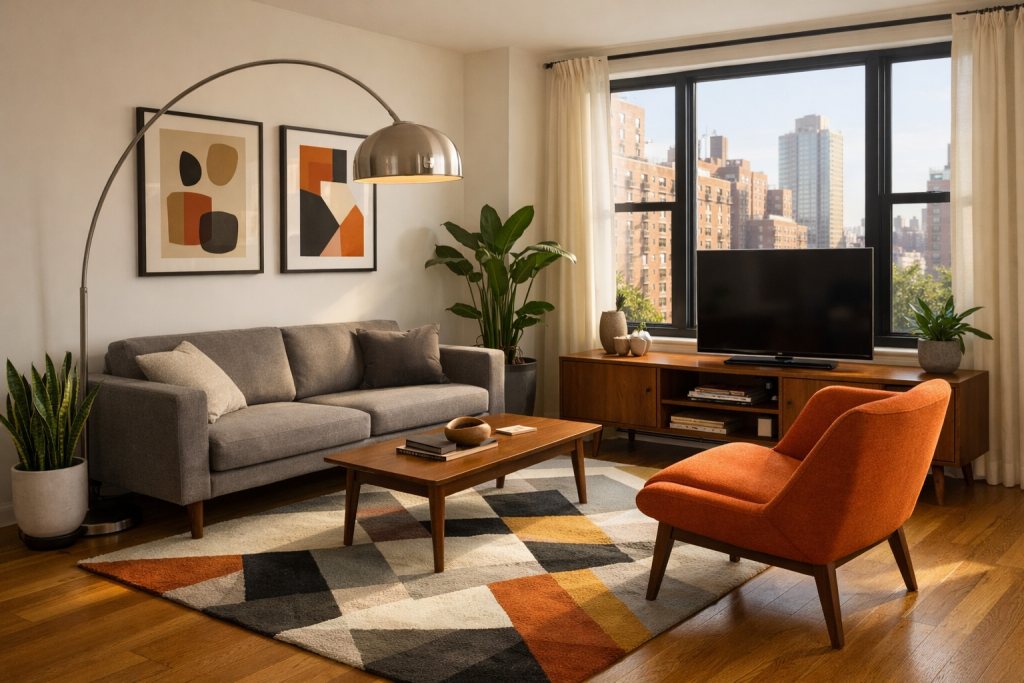
Build A Palette With A Little Discipline
This look works best when the palette stays focused: pale wood, cream, sage, blush, oatmeal, and soft gray. The colors do not need to match exactly, but they should feel like they belong to the same conversation.
A helpful rule is to choose one main neutral, one wood or natural texture, one deeper contrast, and one or two accent colors. That gives the room enough variation to feel layered without making every purchase a new design direction.
Use Texture To Make The Room Feel Finished
Texture is the difference between a room that looks assembled and a room that looks lived in. Fabric, wood grain, woven fibers, ceramic glaze, stone, metal, and plants all catch light differently.
If the room feels flat, do not immediately add another color. Add a thicker rug, a woven basket, a linen curtain, a ceramic lamp, a wood table, or a softer pillow. Most rooms need more tactile contrast before they need more visual noise.
Choose Lighting Early
Lighting should be part of the design plan, not an afterthought. A beautiful room can still feel wrong if the light is cold, too bright, or coming from only one overhead fixture.
Aim for layered lighting: one ambient source, one task source, and at least one softer glow. Warm bulbs, fabric shades, ceramic bases, brass details, and dimmers can make even affordable furniture feel more elevated.
Make The Room Work For Real Life
A good room photograph can hide inconvenience, but your home cannot. Before buying decor, think through the daily behavior of the space: where things land, where cords go, what needs to be stored, and how people actually move through the room.
The best version of this style will still have places for remotes, chargers, blankets, toys, towels, mail, books, or work supplies. Hidden storage and good layout choices make the pretty parts easier to maintain.
What To Avoid
The biggest mistake with this look is making the room so minimal that it has no warmth or storage. That usually happens when the room is copied from a trend instead of built around the way the space will be used.
Avoid buying a full set of matching pieces all at once. Rooms feel more expensive when they look collected. Mix new and vintage, smooth and textured, light and dark, practical and decorative.